I’m currently a full time student studying a bachelor of design at Swinburne Online with a major in communication design. Over the course of my studies I have received both a letter of commendation from Samar Zutshi, The Academic Director of Swinburne Online and a Career Development Certificate. Im also currently participating in the Swinburne Online Student Community Leader program. Determination is a personal strength of high value and this is reflected in my achievements and ability to always produce a finished product to a professional standard.
Chris Sanchez
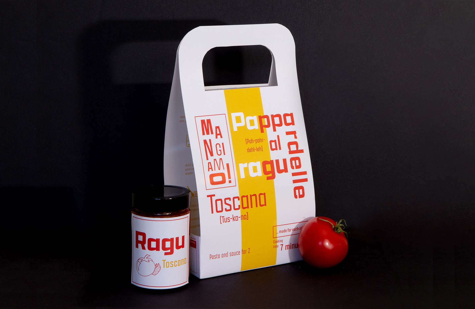
Mangiamo!
The packaging for the mangiamo! brand needed to have a strong colour scheme and striking contrasts to pair with its uniquely shaped package. The design centered around educating an international market about Italian culture rather than filling the packaging with unintelligible Italian words. There is a strong focus on the pairings of pasta and capturing their qualities through visuals between the variations. Typography is the main element which adapts to this however there are more subtle differences to each package such as the yellow stripe and layout of the typography itself.

Mayhem
This set of postcards is designed using several mark making techniques to create an emotional response with the audience. The colour and composition adds tension to the design while the rough imagery gives the postcards a sense of mayhem.

1533
Each packaging variation featured a different kaleidoscopic pattern. The colour scheme and pattern work changes depending on the flavour of the macaron.

War memorial
Capturing the war memorial within a symbol was difficult as there are many sensitive factors to be considered. The premise of the design was to work with the poem by John McCrae In Flanders Fields.

Beecause
This campaign was for a pop up store which was focused on the message of saving bees. The striking combination of black and yellow made for an iconic campaign identity.